

Editor’s Note: What does an outbreak in London in 1854 have to do with predicting a stock’s future price moves in 2026? Read today’s Wealthy Retirement from TradeSmith CEO Keith Kaplan to find out.
Then keep reading to learn about a special tool Keith and his team developed that helps identify periods of time when a stock is most likely to surge higher.
Keith also mentions an event taking place on Tuesday, January 20, at 10 a.m. ET – Prediction 2026 – where he will take a deeper dive into how this tool works and the best ways to put it to use.
– James Ogletree, Senior Managing Editor
In August 1854, a terrifying illness swept through Soho, London, during one of the hottest summers the city could remember.
People were dying in hours – by the hundreds.
Their bodies lost fluid so fast that their skin shrank and their lips turned blue. Victims collapsed where they stood – on stairwells, in courtyards, on their doorsteps.
Medical authorities blamed “miasma” – or bad air – seeping from open drains, rotting refuse, and poorly ventilated slum housing. Newspapers warned of “poisonous vapors” rising from the city streets.
John Snow, a pioneering London physician, wasn’t convinced.
In earlier outbreaks, he’d noticed that people who did not share air were falling ill, while others who breathed the same air remained healthy. Instead, what the victims shared was water.
To test his suspicion, Snow mapped the Soho outbreak.
Armed with a notebook and a street map, he walked the neighborhood, marking each death with a short black line.
As the marks accumulated, a clear picture emerged. The deaths clustered around a single point – a public water pump on Broad Street.
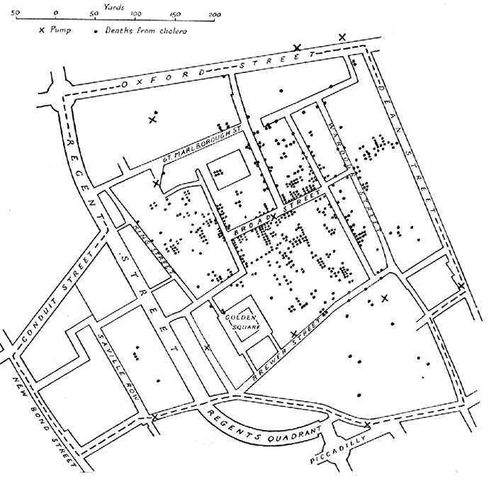
A copy of John Snow’s 1854 map of deaths in Soho, London
The illness was cholera – a fast-moving waterborne bacterial disease – and when officials removed the pump handle, the outbreak stopped.
Once someone knew where to look, what looked like chaos turned out to be structured.
Many complex systems behave the same way. On the surface, they appear noisy and unpredictable. But when you step back and study them over time, recurring patterns begin to emerge.
The stock market is no different.
I know because my team and I at TradeSmith have developed cutting-edge software that identifies recurring seasonal patterns in thousands of stocks – specific times of year when they tend to rise and others when they tend to fall.
And there are some fast-approaching seasonal windows that you need to be aware of. That’s why we’re hosting an online event all about what’s coming – Prediction 2026 – next Tuesday, January 20, at 10 a.m. ET.
Ahead of the event, we’ve unlocked a trial version of our groundbreaking seasonal software. It allows you to look for seasonality patterns in the stocks you own or are thinking of buying.
So, make sure to register for that here to unlock your free access. Then read on for more on the seasonality phenomenon in markets – and how, over the last 15 years, some stocks have followed their seasonality windows with 100% historical accuracy.
Seasonality Affects Markets Too
Commodity traders have long tracked planting and harvest cycles in crops like corn and wheat.
Energy traders watch seasonal demand shifts tied to winter heating and summer cooling.
The gold market has recurring seasonal tendencies, often strengthening during certain parts of the year tied to jewelry demand, central bank buying, and annual festivals in India and China.
And stock investors have studied phenomena like the “January Effect” for decades. Even Wall Street’s old saying – “sell in May and go away” – comes from observed seasonal behavior, not theory.
But seasonality doesn’t just apply to commodities and the big stock market indexes. Every stock has its own seasons to rise or fall – a kind of summer and a kind of winter too – year after year.
Big-box retailer Target (TGT) provides a good example.
As one of America’s largest retailers, this stock moves with the rhythms of consumer spending throughout the year. But for all the money won – and lost – on Target over the last few years, there’s one certainty…
Between June 22 and July 21, you want to buy the retail bellwether. Target has moved up an average of 5.2% during that summer period, rising 100% of the time over the past 15 years:
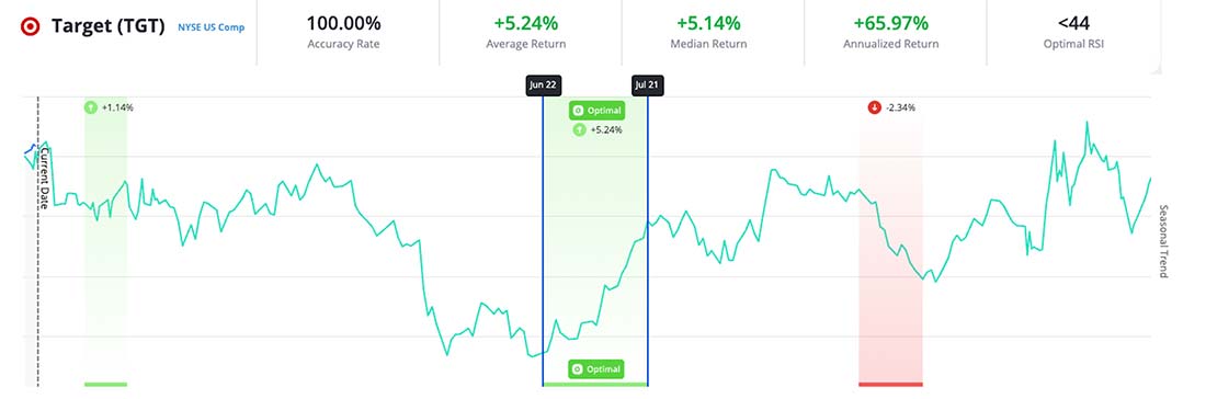
That’s 15 years of summertime price spikes, starting long before it fell under the pandemic-era spotlight. And in 2025, the pattern held true: Target rose 10.3% during its 29-day seasonally bullish window.
The chart you’re seeing above is from one of the breakthrough innovations from TradeSmith’s team of researchers, software engineers, and quant investors: our ground-breaking Trade Cycles Seasonality tool.
It’s an easy-to-use tool that can take one of thousands of commonly traded stocks, analyze its movements, and point out its strongest seasonality trends – with starting periods narrowed down to the day.
Here’s another example of a strong seasonality pattern, this time in Home Depot (HD):
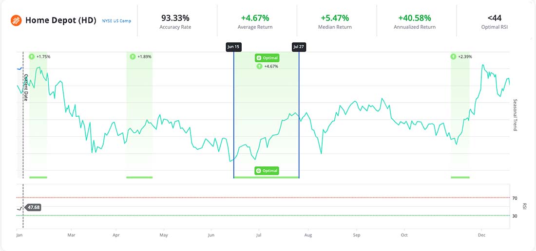
Over the last 15 years, between June 15 and July 27, Home Depot’s share price has risen 93% of the time, with an average return of 4.7%.
And in 2025, the pattern held true again. It rose from $349.31 on June 16 to $372.69 on July 28 – a 6.7% gain in just over a month.
A Powerful New System for Seasonal Profits
Target and Home Depot are just two examples among many others.
Our development team has fine-tuned this tool to uncover seasonality cycles in stocks, stock market indexes like the S&P 500 and the Nasdaq, as well as in currencies and commodities.
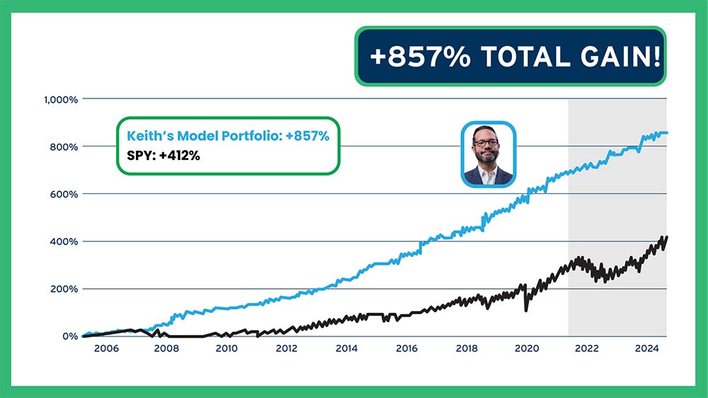
By crunching the data and compiling the historical movements of thousands of different assets and running 50,000 tests a day to analyze every stock in the major indexes, we’ve built a powerful system to help predict the biggest jumps on 5,000 stocks.
Over our 18-year backtest, these seasonal trades delivered 857% in total growth. That’s more than twice what the S&P 500 delivered over the same time.
Even in 2007, the worst year in our testing, we saw an average gain of 2.5% per trade and an average annual return of 37.9%. That’s close to four times the long-term average annual gain of the S&P 500.
The question now: How can we make this powerful system work for you?
The Power of Seasonality Is Now in Your Hands
Go here to register for access to an “unlocked” version of TradeSmith’s groundbreaking Seasonality tool.
Then you can explore the results of our powerful research for the stocks you own – or are thinking of buying. It’s available online until Monday, January 19.
Then on Tuesday, January 20, at 10 a.m. ET during our Prediction 2026 webinar, I’ll show you how our Seasonality tool can help you find the best time to buy and sell a stock – down to the day.
And as we start the new year, a new batch of these seasonal cycles is about to kick off…
Go here now to register for the event – and give TradeSmith’s Seasonality tool a try, free of charge, before the big event.
I hope to see you there!
Keith Kaplan
CEO, TradeSmith